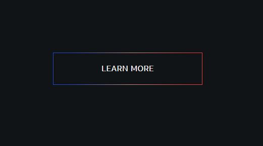
Botón con borde degradado
Ejemplo de un enlace que simula ser un botón y tiene un borde degradado.
Utilizaremos HTML + CSS para crearlo.
En el hover, tiene un efecto que simula aumentar el tamaño de borde del botón.
HTML
<body>
	<a class="btn" href="#" title="Learn More">
		<span>Learn More</span>
	</a>
</body>
CSS
body{
		background-color: #111416;
		padding:  100px;
	}

	.btn{
		font-family: 'Raleway', sans-serif;
		text-decoration: none;
		position: relative;
		z-index: 1;
		display: -webkit-inline-box;
		display: -ms-inline-flexbox;
		display: inline-flex;
		-webkit-box-align: center;
		-ms-flex-align: center;
		align-items: center;
		-webkit-box-pack: center;
		-ms-flex-pack: center;
		justify-content: center;
		text-transform: none;
		font-weight: 600;
		letter-spacing: .08em;
		min-width: 240px;
		font-size: 14px;
		padding: 4px 28px;
		height: 56px;
		border-radius: 0;
		overflow: hidden;
		background: 0 0;
		text-transform: uppercase;
		color: #fff;
		-webkit-transition: background 1s cubic-bezier(.16,1,.3,1),border-color 1s cubic-bezier(.16,1,.3,1),color 1s cubic-bezier(.16,1,.3,1);
		transition: background 1s cubic-bezier(.16,1,.3,1),border-color 1s cubic-bezier(.16,1,.3,1),color 1s cubic-bezier(.16,1,.3,1);
	}

	.btn:before {
		content: '';
		display: block;
		position: absolute;
		width: calc(100% - 2px);
		height: calc(100% - 2px);
		top: 1px;
		left: 1px;
		background: #111416;
		z-index: -2;
		-webkit-transform: translate3d(0,0,0);
		transform: translate3d(0,0,0);
		-webkit-transition: opacity 1s cubic-bezier(.16,1,.3,1);
		transition: opacity 1s cubic-bezier(.16,1,.3,1);
	}

	.btn:after {
		content: '';
		width: 100%;
		height: 100%;
		display: block;
		position: absolute;
		top: 0;
		left: 0;
		-webkit-transform: translate3d(0,0,0);
		transform: translate3d(0,0,0);
		-webkit-backface-visibility: hidden;
		backface-visibility: hidden;
		z-index: -3;
		background: linear-gradient(94.23deg,#2446cc 12.41%,#cc8b7d  52.55%,#e14141 89.95%);


	}

	.btn:hover:before{
		margin-top: 1px;
		margin-left: 1px;
		width: calc(100% - 4px);
		height: calc(100% - 4px);
	}
Resultado